
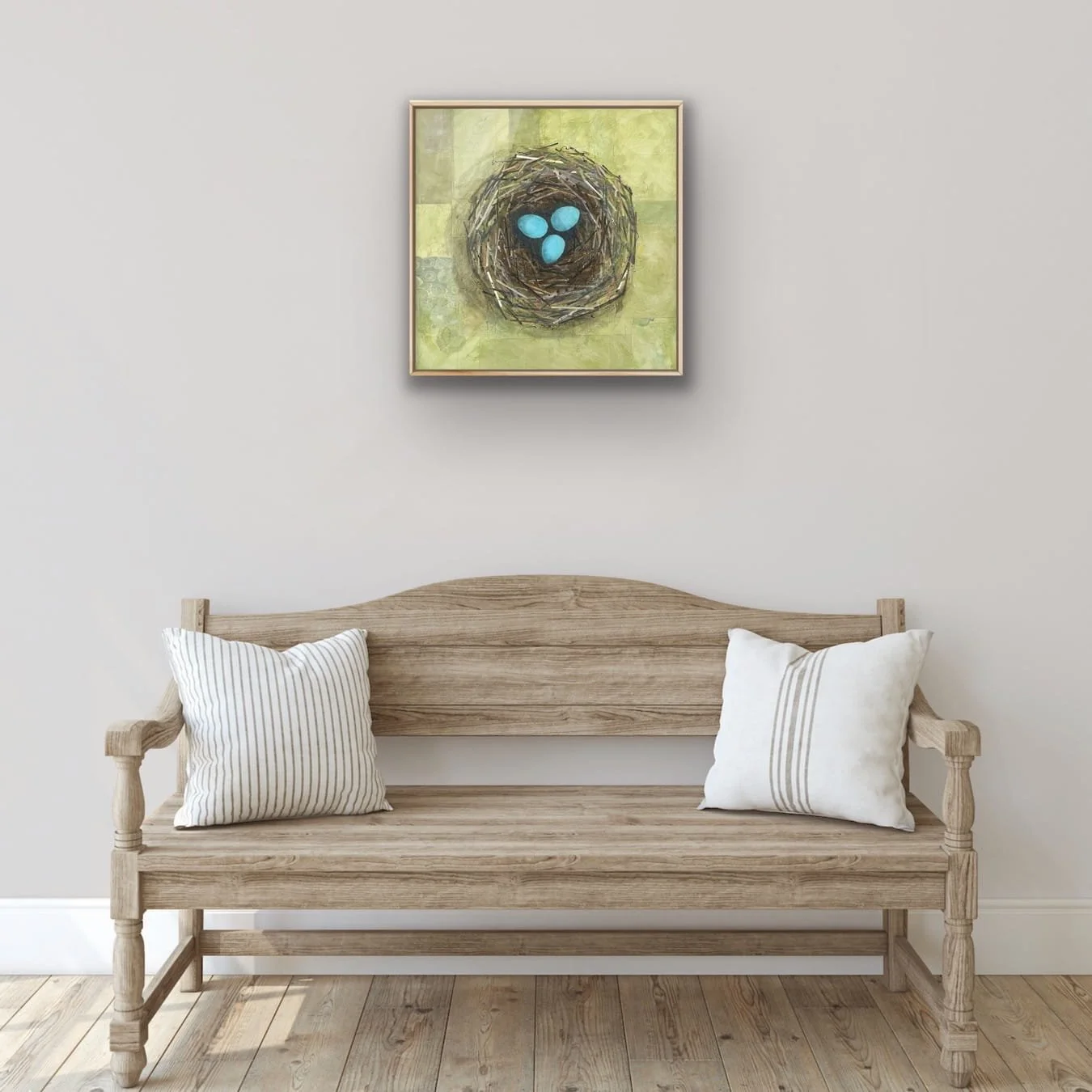
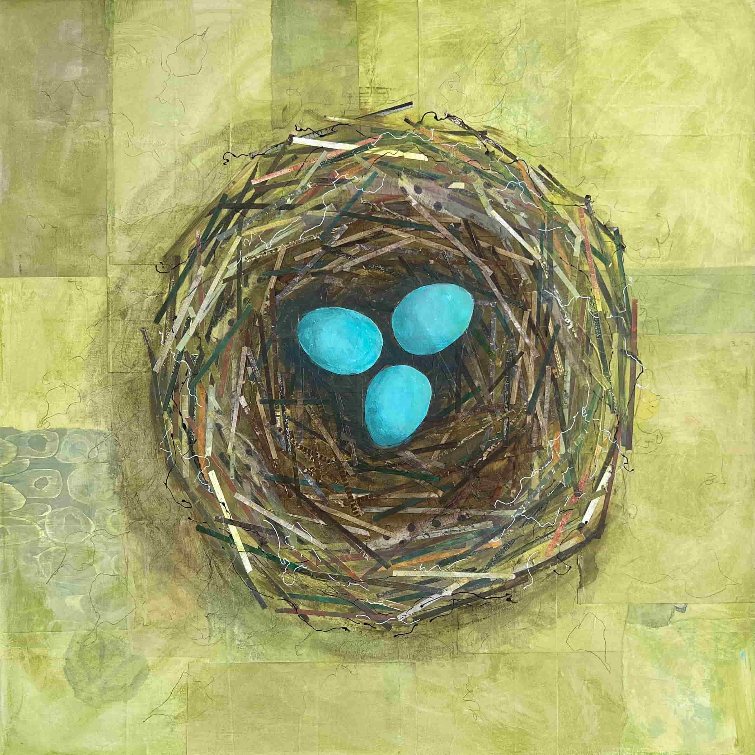
The Story Behind The Nest
Nests have always felt like a perfect symbol of home to me—delicate, hardworking, and full of quiet trust. In The Nest, I kept the background soft and breathing so your eye goes straight to those bright blue eggs, held safely in a rhythm of paper, ribbon, and twine. While making it, I kept thinking about how we create a sense of “home” through the small, meaningful details we choose to keep close.
The Problem with “Important Art”
“Important art” is one of those art-world phrases that sounds neutral, but isn’t. It often means endorsed—by the people who get to define importance—and that can quietly shape what artists think they’re allowed to make. Because the definition of “important” shifts with trends and institutional priorities, it becomes a moving target. I’d rather chase honesty and make work that feels true, with or without the “important” stamp.

No Drawing Skills Needed: A 10-Minute Pattern Walk for New Art Ideas
This simple 10-minute pattern walk helps you see repetition in nature and turn it into marks and shapes. You’ll create a quick pattern study that can feed your next piece.
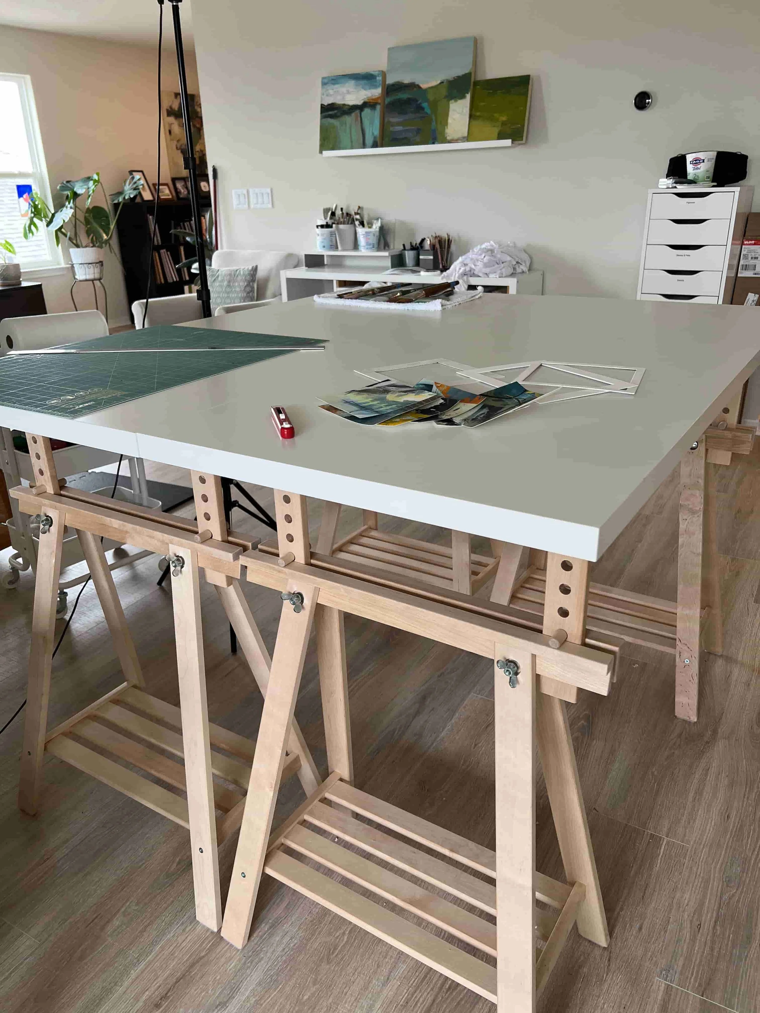
My Favorite Studio Table (Made from IKEA + a Little Ingenuity)
I built my favorite studio table from a simple IKEA combo because it solves a real workflow problem: flexibility. It adjusts in height so I can stand or sit, it’s made from two tables pushed together (or split apart), and the ends can be angled when needed. The result is a sturdy, adaptable “home base” for collage, paint mixing, and staging works-in-progress.
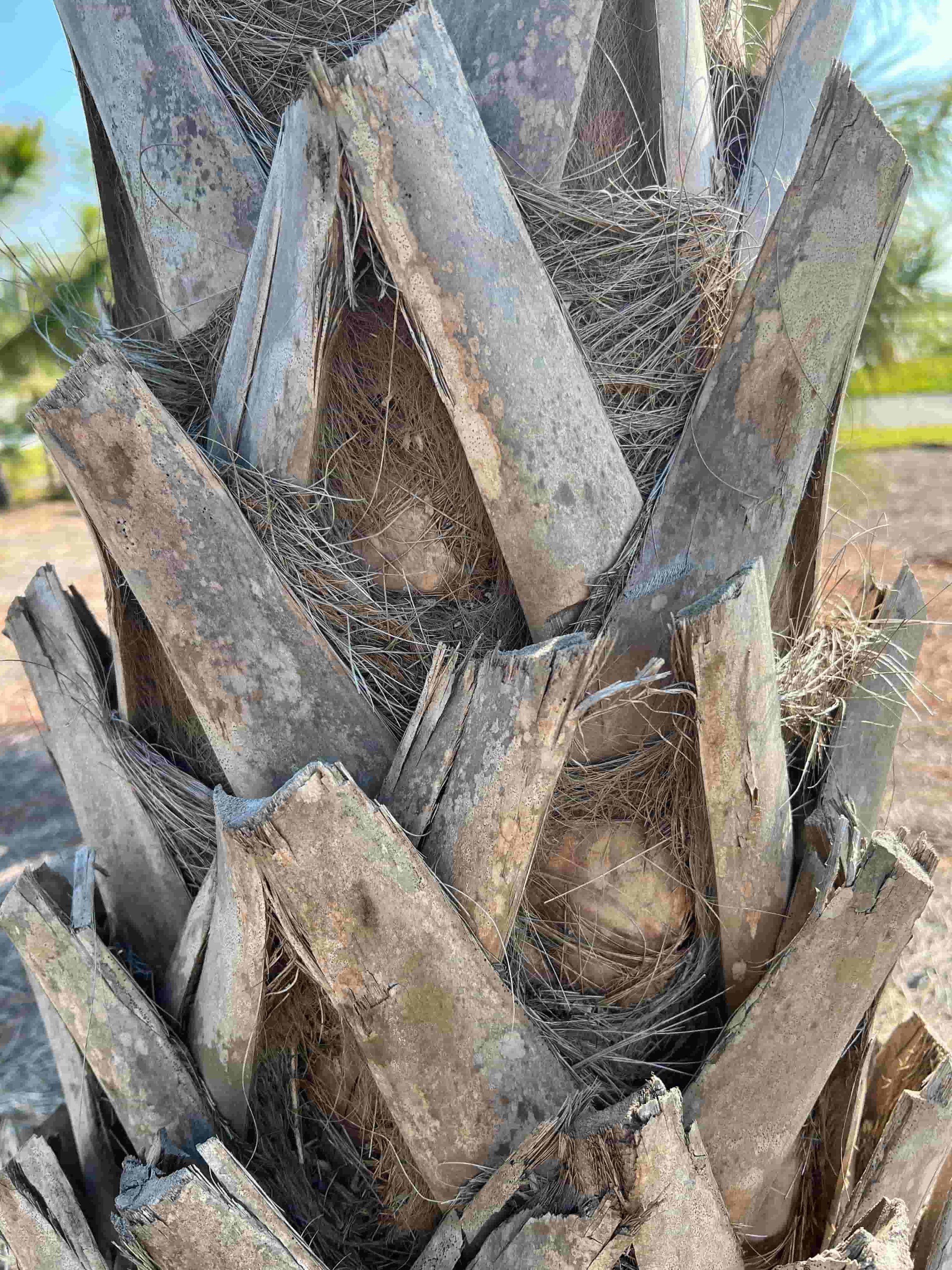
Patterns in the Wild: A Composition Lesson From Nature
Pattern is one of the simplest, most powerful tools in composition: repetition. In this post, I explore how repeating line, shape, color, or value creates rhythm, unity, and movement in a piece of art. On a recent nature walk, I noticed patterns everywhere—from bark and shadows to stones and grasses—and reflected on how nature’s imperfect repetition (with variation and surprise) can inspire stronger, more alive compositions.
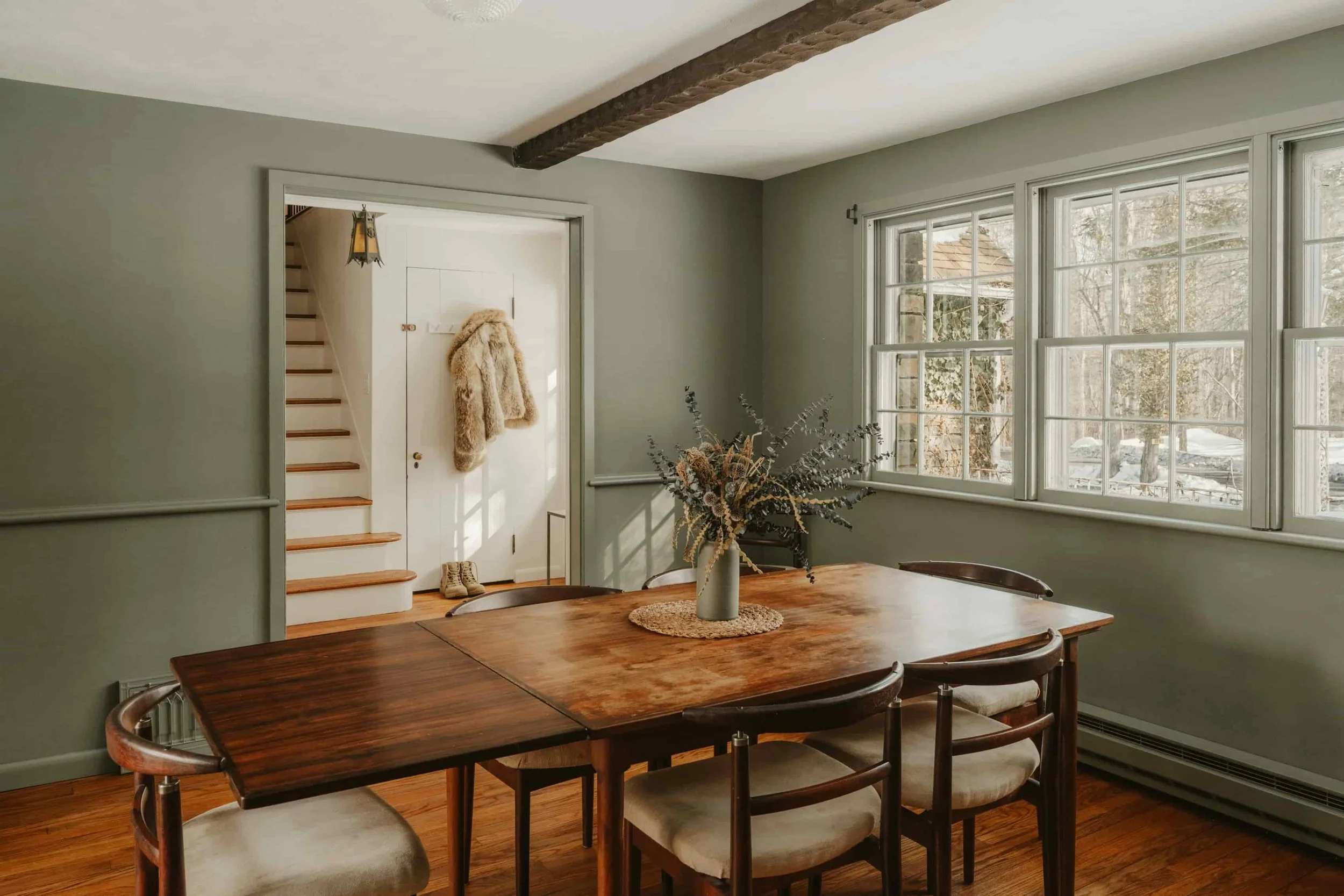
Green in Interiors: The Color That Makes a Room Feel Alive
Green has been trending in interiors for good reason: it brings calm, depth, and an instant connection to nature. In this post, I share easy ways to add green without renovating—through art, plants, and a few well-chosen accents. You’ll also find color pairings that always work (creams, wood tones, black, terracotta, blush, and smoky blues) plus a simple repetition-and-balance checklist to make green feel intentional in any room and help your space feel alive today.