
Green in Interiors: The Color That Makes a Room Feel Alive
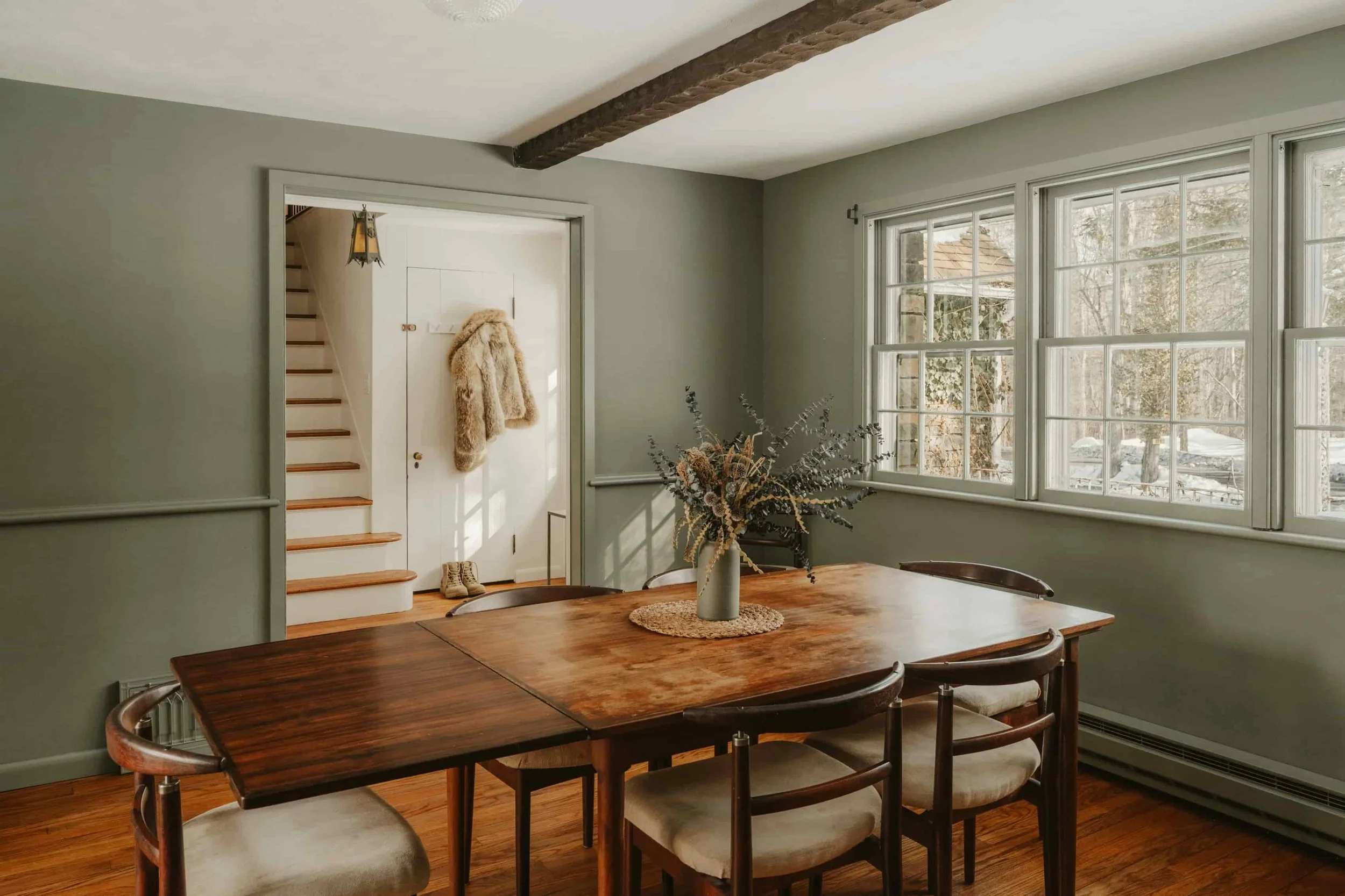
Photo by Clay Banks on Unsplash
Green has been having a real moment in interiors for a couple of years now (yay!) and I don’t think it’s going anywhere. It’s one of those colors that can feel both fresh and timeless—because it comes straight from nature.
If you’ve been thinking about adding more green to your home (without committing to green cabinets or painting an entire room), this is for you. Below I’ll share a few easy ways to bring green in, what colors pair beautifully with it, and a simple way to make it all feel cohesive.
Why green works so well at home
Green tends to do at least one of these things in a space:
It softens a room and makes it feel more lived-in
It brings a sense of calm (especially the quieter greens like sage, olive, moss)
It adds “life” and depth without shouting for attention
It connects your home to the outdoors—even if you live in the middle of a city
In other words: green is color, but it often behaves like a neutral.
What colors go well with green?
The best pairings depend on what kind of green you’re drawn to (soft and muted vs. deep and dramatic), but all of these combinations work well:
1. Warm whites + creams
This is the easiest place to start. Green against warm white feels clean, natural, and elevated—never stark.
Try it with:
ivory walls
linen upholstery
creamy ceramics
light oak floors
2. Wood tones (light, medium, and dark)
Green and wood is one of the most natural combinations there is because it comes straight from nature. Wood brings warmth; green brings freshness.
Try it with:
walnut + olive green
white oak + sage
vintage wood + deeper forest greens
3. Black accents
Black gives green a little edge and structure. Even a small amount (a frame, a lamp, a side table) can make green feel modern.
Try it with:
black frames around artwork
matte black hardware
black-and-white textiles
4. Clay, terracotta, rust
This pairing is so lovely and enveloping. Green + earthy reds/oranges feels grounded and creative.
Try it with:
terracotta planters
a warm-toned rug
a throw pillow with a faded rust tone or tribal pattern
5. Soft blush or dusty pink
This is the combination I have in my living room and I love it! It feels warm, soft and comforting. My walls are Scallop by Farrow & Ball and I have a green velvet chair and two green ottomans.
Try it with:
pale blush pillows or even a cream and red patterned pillow
dusty rose pottery
muted pink-toned textiles
6. Blues (especially smoky or denim blues)
Green and blue can feel coastal, calm, and sophisticated—especially when both are a little muted.
Try it with:
blue-gray walls + green accents
denim-toned textiles + green art or plants
3 easy ways to add green (without renovating anything)
If you want the effect of green in your home without making a big commitment, try these ideas.
Add green through art (my favorite, because it does more than one job and I paint…)
A painting with green can:
introduce the color
pull together other tones in the room
add mood and atmosphere
create a focal point that feels intentional
Art is also a beautiful solution if you want green in your space but don’t necessarily want it on every surface.
A simple guideline: choose green that matches the feeling you want
Soft greens (sage, olive, moss) feel calm and grounded
Deeper greens (forest, emerald) feel rich and dramatic
Brighter greens feel energetic and playful (best in smaller doses)
Add green through plants (the fastest way to make a room feel good)
Plants instantly bring life into a space. If your home feels a little flat or “done but not finished,” plants are often the missing layer. Check out this article from designer Rita Konig on greening up a room with plants.
If plants stress you out, keep it simple:
pick one reliable plant you can handle
cluster two or three together rather than scattering tiny ones everywhere
choose a planter color that matches your room (warm white, clay, black, woven baskets)
Even a single leafy plant near a piece of art can make the whole vignette feel richer and more alive.
Add green through textiles and objects (supporting actors)
If you’re not ready for a big visual statement, small touches can do the trick:
a throw pillow
a blanket
a small vase
a bowl on the coffee table
a green book spine in a stack
The key is to repeat green at least twice so it feels cohesive, not accidental.
How to make green look intentional (not random)
Here’s the trick designers use: repetition + balance.
Repetition
If you introduce green once, it can feel like it’s “floating.” If you repeat it 2–3 times, it starts to feel like a palette.
An easy formula:
one larger green element (art or a plant)
one medium element (a pillow, a throw, a vase)
one small echo (a book, a candle, a little ceramic piece)
Balance
Green can be the star of the room, or it can be the quiet thread that ties everything together. Either is great—just decide which role you want it to play.
A simple “try this” mini-checklist
If you want to experiment this week, try this:
Choose one green you love (soft? deep? bright?)
Add it in one meaningful way (a painting or a plant is a great start)
Repeat it once or twice somewhere else
Keep the supporting colors warm and natural (cream, wood, black, clay)
Green has this generous way of making a home feel welcoming—like you can exhale when you walk in.