
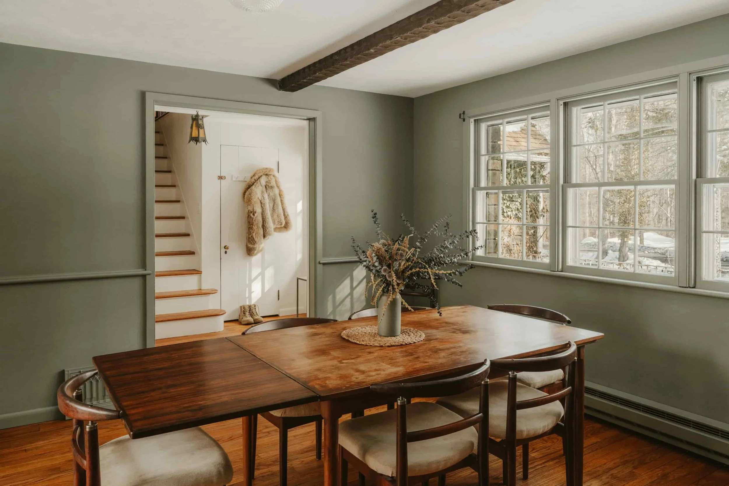
Green in Interiors: The Color That Makes a Room Feel Alive
Green has been trending in interiors for good reason: it brings calm, depth, and an instant connection to nature. In this post, I share easy ways to add green without renovating—through art, plants, and a few well-chosen accents. You’ll also find color pairings that always work (creams, wood tones, black, terracotta, blush, and smoky blues) plus a simple repetition-and-balance checklist to make green feel intentional in any room and help your space feel alive today.
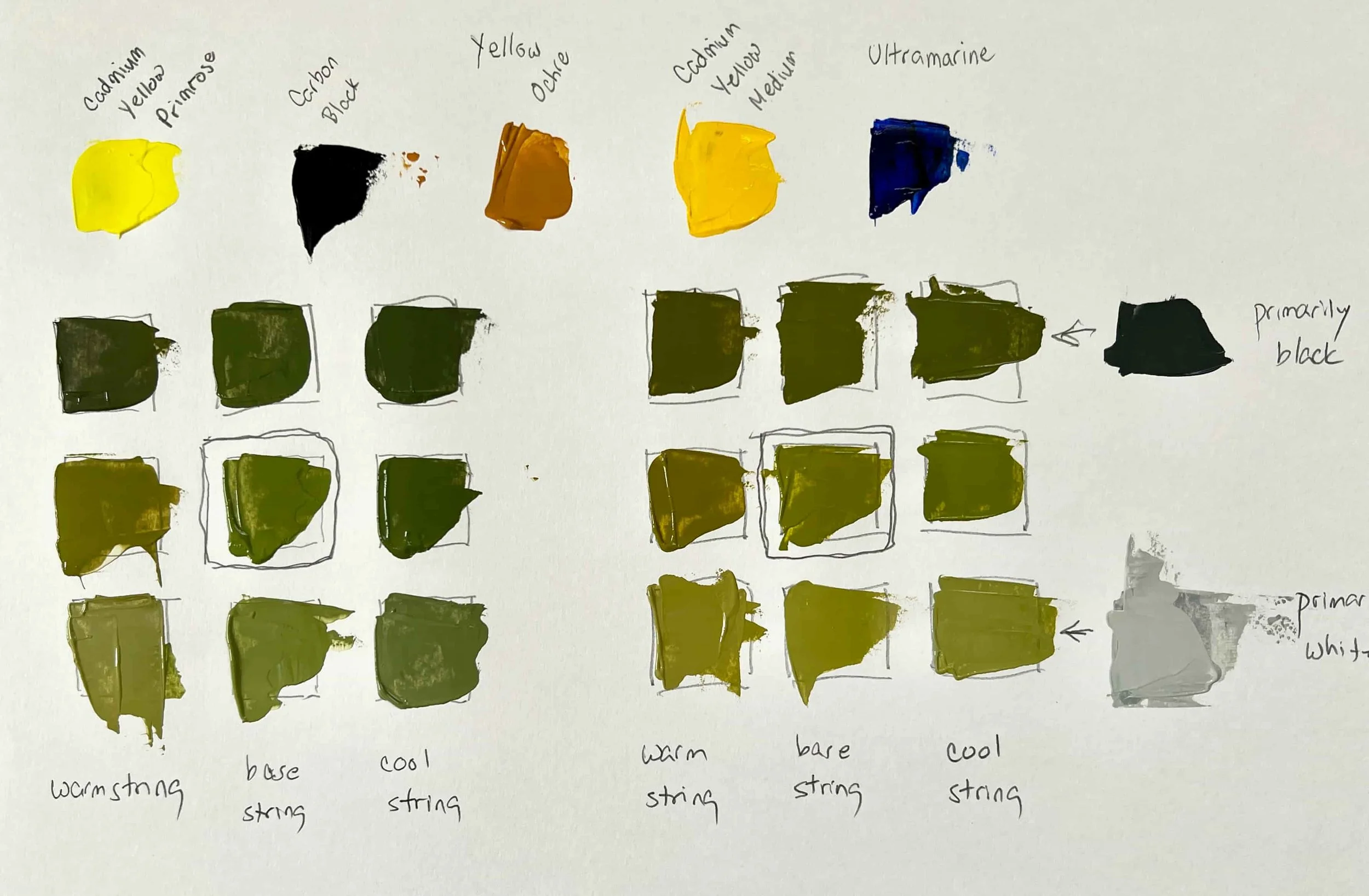
Mixing Greens: Tried and Tested Recipes
If you’ve ever mixed a green that instantly felt wrong, this post will help you fix it fast. I’m sharing two dependable base-green recipes—one natural (yellow + black) and one brighter (yellow + ultramarine)—plus a simple order of operations: get a mid-value base first, shift temperature (warm/cool) next, then adjust value with a four-step grey string. You’ll also get quick fixes for greens that go neon, muddy, or unnatural.
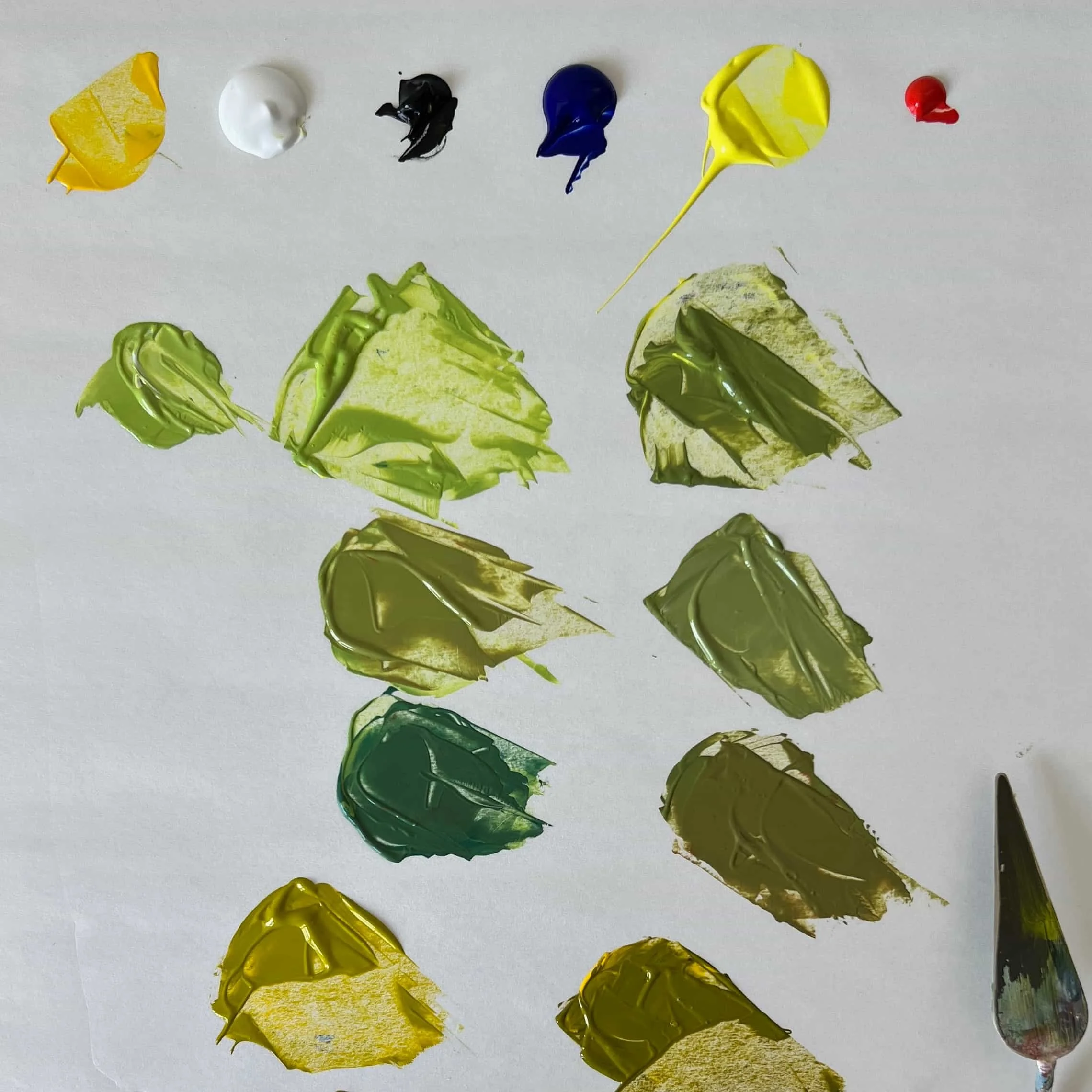
How to Mix Greens You Actually Want (No Tube Green Required)
Green isn’t difficult—greens are specific. Learn how chroma, temperature, and value help you mix the green your painting is actually asking for.
Neutral Colors: Creating Harmony and Sophistication
Neutral colors are versatile and essential in art and design, offering balance, sophistication, and calm. While sometimes criticized, they allow vibrant hues to shine and create harmony. Learn how to mix your own neutrals and embrace their beauty.

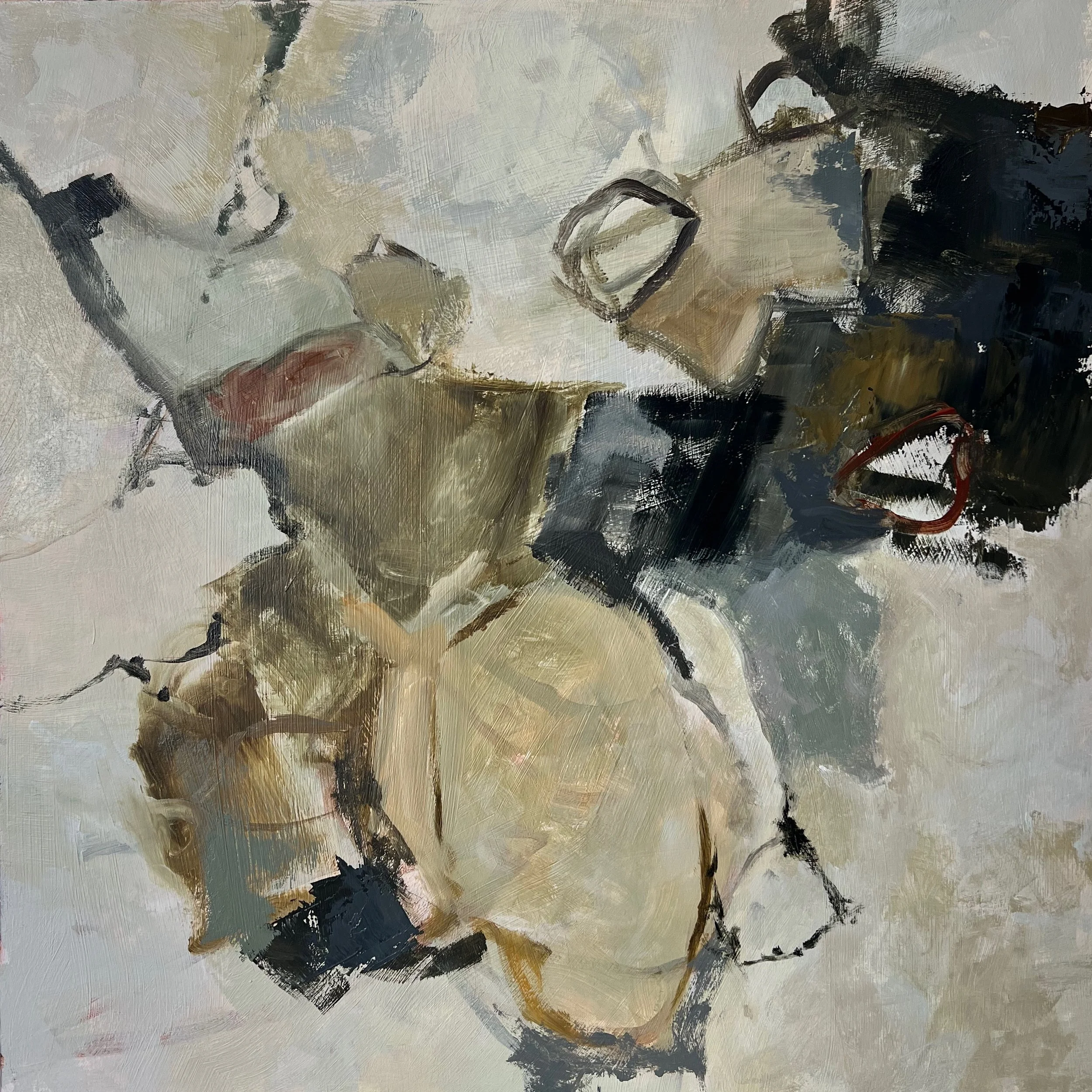
What Does It Mean to Be a “Colorist?”
Despite my love for neutral tones, I consider myself a 'colorist.' In this post, I explore what it means to be a colorist, my admiration for artists like Pierre Bonnard and Fred Cuming, and how I use a limited palette to evoke emotion and create harmony in my abstract art.