
How to Mix Greens You Actually Want (No Tube Green Required)
I’ve heard people say “green is a difficult color” for as long as I’ve been painting. Even my sister told me greens “were hard.” And every time I hear it, I think: Really? Green is one of the most generous colors in my palette.
What I do think is true is this: greens are specific. A tiny shift in temperature (warm or cool), value (light to dark), or intensity can completely change the mood of a painting. So it’s not that green is hard… it’s that it asks you to be intentional.
In this post, I’m going to focus on how to mix greens with confidence. Not just “a green,” but the kind of green you want—whether you’re going for bright and lively or natural and muted—and how to control the chroma so your greens feel like they belong in your painting.
The real reason greens go wrong: “tube green + panic”
Tube green isn’t “bad,” but trying to use that green directly from the tube is probably going to cause a lot of frustration. Most greens straight from the tube are extremely high-chroma - they appear very intense, bright and jarring (especially next to quieter, more neutral passages). Then the panic sets in: you start adding random things to “fix it,” and pretty soon the color gets muddy or chalky and you’re even more convinced green is hard.
What’s really happening is simple: you started with a green that has a very strong personality, and now you’re trying to make it behave like a completely different green—one that’s warmer, grayer, deeper, more atmospheric, more “natural,” or more specific to your painting’s mood.
I’m not saying never use tube green but I do think if you start with your own mixed green, you stay in control—of chroma, temperature, and value—and green becomes straightforward again. Once you know how to bend the greens you mix to begin with, you can try the some process on some tube greens.
Decide the kind of green you need (chroma + temperature)
To make mixing greens feel easy, start by answering two questions:
How intense do you want this green to be?
Should it to lean warm or cool?
That first question is about chroma. Chroma is just intensity—how bright and “pure” a color looks versus how muted and neutral it feels. A high-chroma green can feel electric and fresh. A lower-chroma green can feel calm and natural. Neither is “right”—they just create different moods.
The second question is about temperature. Warm greens are more yellow (think sunlit grasses). Cool greens lean blue (think pine, deep water, shadow greens). When a green feels “off,” it’s often not the green itself—it’s that the temperature doesn’t match the light in the painting.
So before you mix, decide which of the following intensities you are after:
High-chroma (punchy, springy, graphic)
Medium-chroma (most landscape greens)
Low-chroma (dusty, atmospheric, far-away, also landscapey)
Once you decide on the chroma and temperature you want to work with, mixing greens gets much more straightforward—because you’re not searching for “the” green. You’re mixing the specific green your painting is asking for.
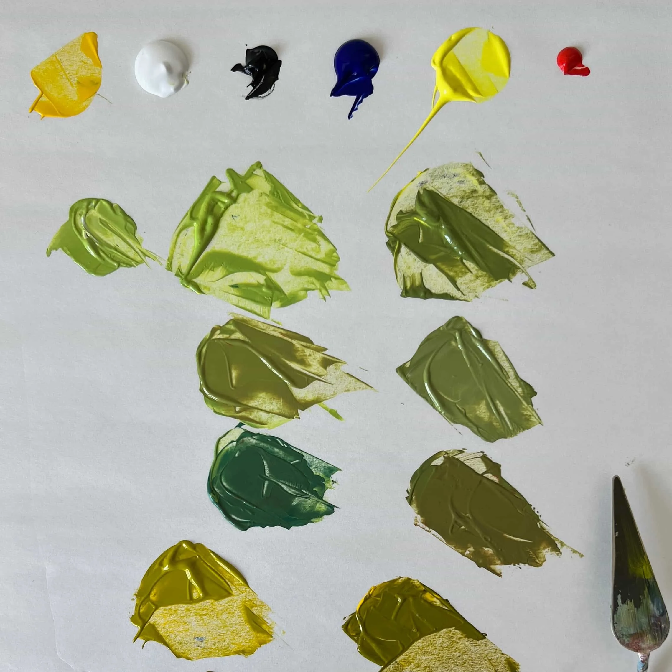
Build your base green (simple mixing paths)
Try starting with a base mix that already meets your specific intent. That way you don’t have to spend a lot of time fixing things.
Here are two to start with.
1. Yellow + blue (the classic, the one you probably learned in your first art class on color theory)
This is the most flexible way to mix greens because you can steer the mix warmer or cooler just by adjusting the ratio.
More yellow = warmer, brighter, more sunlit greens
More blue = cooler, deeper, more shadowy greens
2. Yellow + black (surprisingly natural and my favorite because it feels like magic every time!)
This one surprises a lot of people, but it can create beautiful, believable greens—especially for landscape painting.
Depending on the yellow you start with, yellow + black can swing from a warm olive all the way to a deeper earthy green. It’s also a great way to build greens that already feel grounded.
One practical tip: start with small amounts of black relative to the amount of yellow. Things can go dark very quickly.
Control chroma (this is the ‘secret’)
The simplest (and most powerful) tool is neutralizing: if a green feels too crazy and loud, add a tiny touch of red. Red is green’s complement, so it pulls the intensity down. Go slowly—this is the kind of adjustment where a pinhead amount can be enough.
From there, think about these three adjustments.
1. Shift the temperature
If the green feels cold, warm it with a little more yellow
If the green feels too grassy or too warm for the space, cool it with a touch more blue.
2. Check the value (light/dark) before you continue to adjust the hue
Sometimes the problem isn’t the green—it’s that it’s too light or too dark compared to what’s around it. If the value is off, you can mess with the hue forever and it still won’t be right.
3. Decide how “natural” you want it to feel
A lot of landscape greens live in the medium-to-low chroma range. Muted greens often make the occasional brighter green feel even more alive.
Once you get comfortable neutralizing (and checking value), you can mix almost any green you want—bright, quiet, earthy, or deep—without the panic.
Green isn’t difficult—greens are specific
So no—green isn’t difficult. Greens are just specific. Once you start thinking in terms of chroma, temperature, and value, you stop hunting for “the” green and start mixing the green your painting is actually asking for.
In the next post, I’ll get very practical and share the actual mixing recipes I use most—specific combinations and a few go-to “green families” you can mix quickly on your palette.